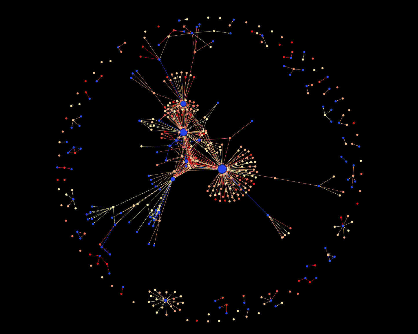
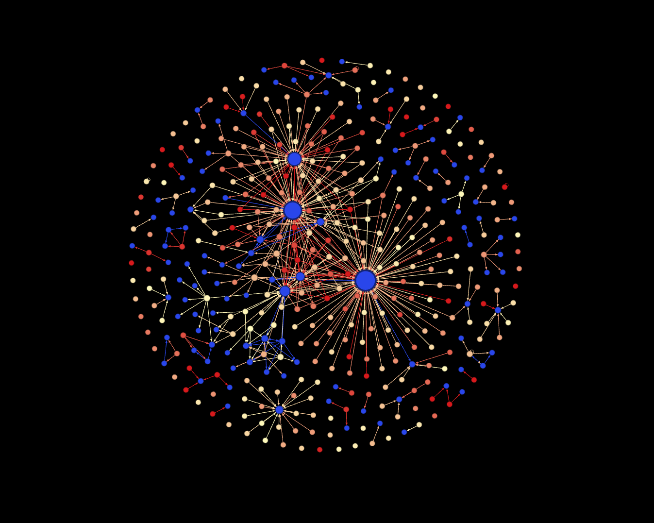
Visualize Twitter
.jpg)
.jpg)
In other words if user 'samzorps' tweets: "Goodmorning, how are you? @twitterBot1", this will be represented as an arrow from 'samzorps' to 'twitterBot1' in the graph.
- The size of a user is determined by how many arrows (incoming or outgoing) they are connected to.
- The color of a user is determined by how many followers they have. The more followers, the warmer the color.
This graph is very useful for seeing which users are 'controlling' the conversation on a particular topic during a particular timeframe. This has many applications, including business strategy.